Reduce Your Page's Image Load
Everyone hates websites that serve overly large images. It shows that they have absolutely no respect for slow or metered connections and only care about being able to create webpages as quickly as possible. You don't have to be like that. However, it's going to take more than just switching to the hot new image format to completely fix issues with images being overly large. In this article, we will go over all the ways you can reduce the size of your web images and improve the page experience. By going from an overly large JPEG to a correctly sized AVIF, you might be able to cut down on bandwidth used by images by 90%.
A Worst-Case Scenario
Say you've been provided a beautiful 3840x2160 image that you want to put onto your website. It's been exported straight out of Darktable as a JPEG of quality 88, which is quite high especially for the web. Being from a typical photo workflow application, it's also been encoded with LibJPEG-Turbo, the least efficient and fastest JPEG encoder there is. This image weighs in at a massive 1.3 MiB, which is completely unacceptable for a web image. On a mediocre 10 Mbps connection, this will take over a full second to load. In this case, you have at least specified the image width and height to avoid massive layout shifts. If you don't do this, the image will push content around as it loads.
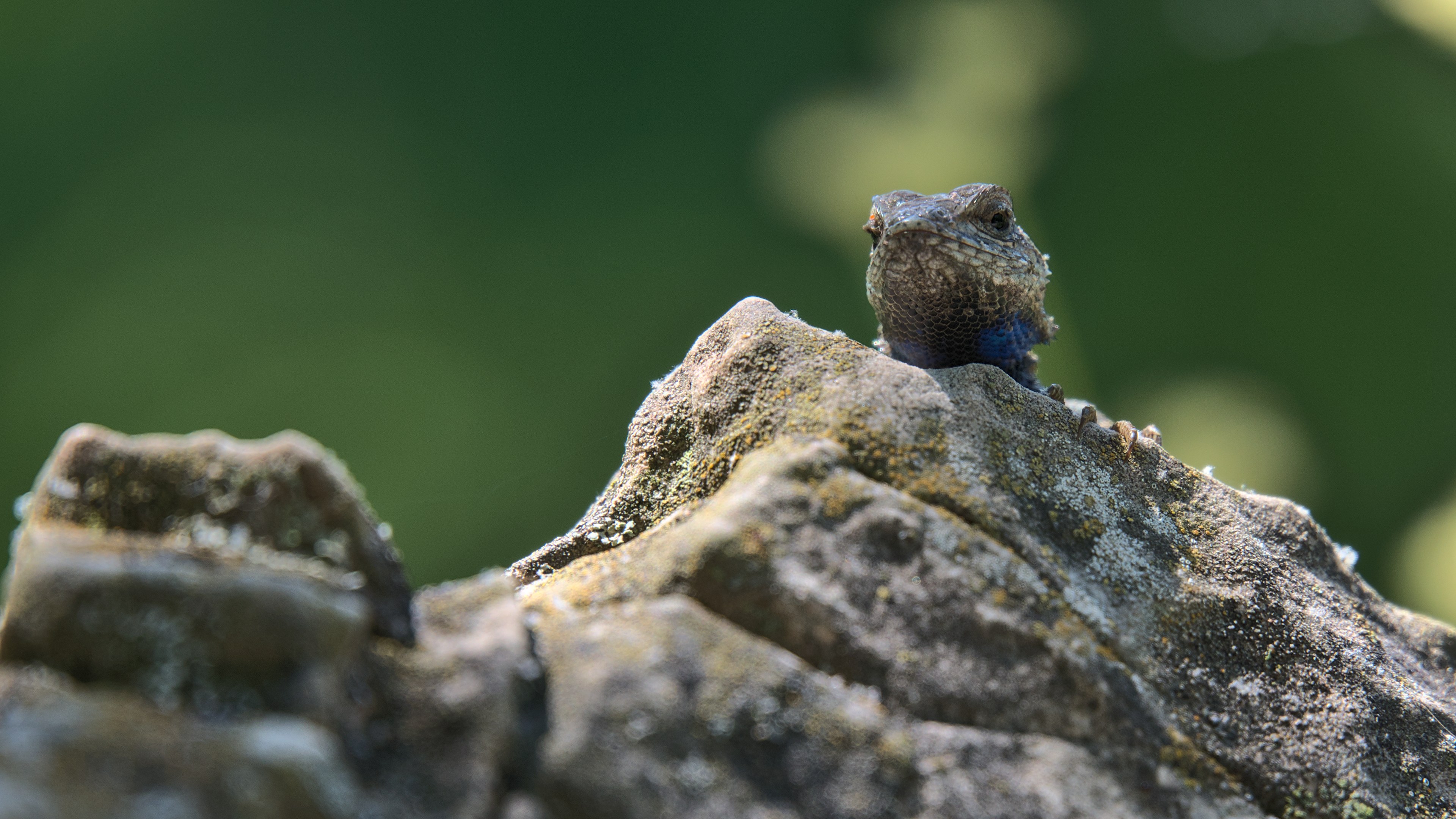 Photo credit: my own photo (CC0)
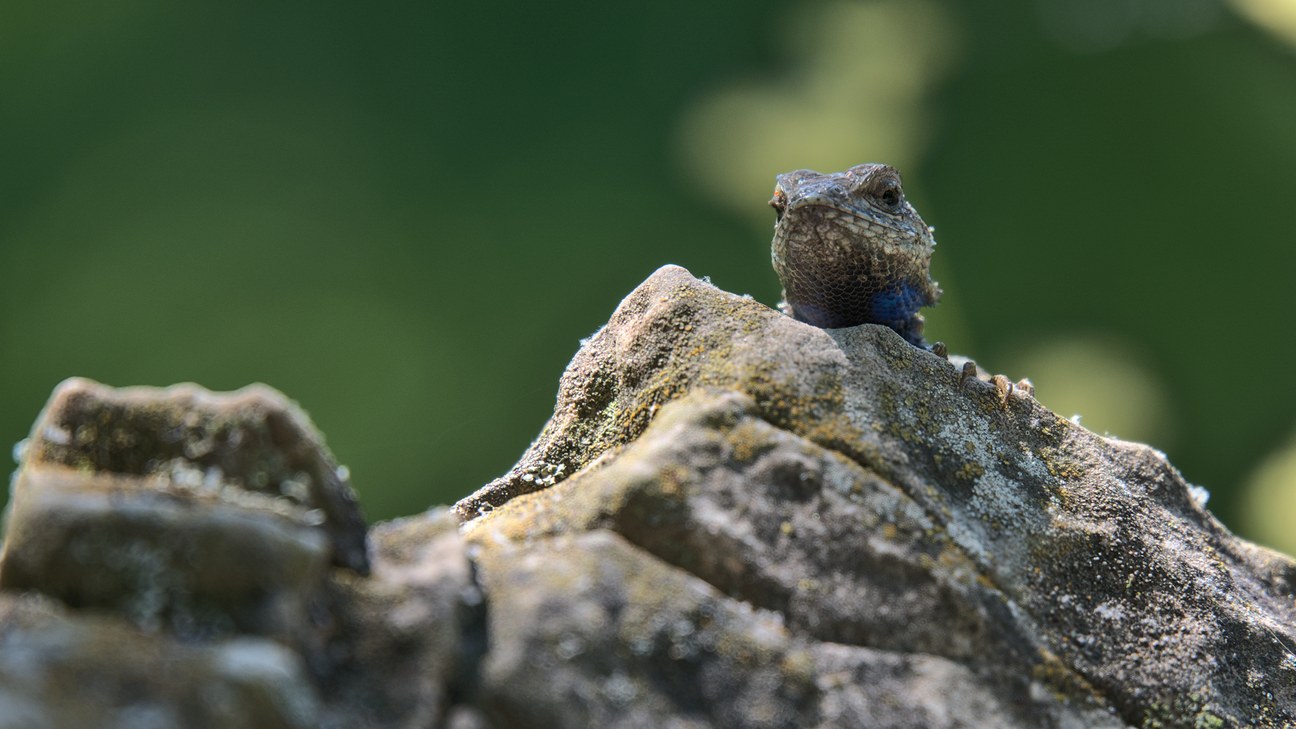
What should be done to fix it?
In order to turn this monstrosity into a good webpage loading experience, we need to do 4 easy steps:
- Reduce image resolution
- Switch to next-gen formats (with fallbacks)
- Make the image responsive
- Lazy-load the image*
Reduce the Image Resolution
To determine the size of the largest image you should be serving, check what the largest width your CSS could display the image at is. This is easy to do by firing up your browser's DevTools on a high-resolution (1440p or 4K) display and using the inspect tool to find the actual width of the image element. On Autocompressor.net, we use Bootstrap v5.2 and put the content into a "container", which has a maximum width of 1296 pixels. This is much less than the original image width of 3840 pixels. Some simple math tells us that we'll want to scale the image to 1296x729. For this example, we'll still be exporting the image straight from Darktable at JPEG quality 88 to isolate the effect of this change alone. There should be little or no perceived quality loss because the original image was too large for the viewport and this is just right.
By doing this, we just went down to 161.3 KiB, a savings of 87.6% against the original, oversized image, without ever touching any new formats or even leaving the Darktable export window.
Use Next-Gen Image Formats
To do all this, we're going to need a high quality source, so we exported a lossless 16-bit PNG from Darktable at the maximum web size of 1296x729. We won't just be adding AVIF and WebP to our arsenal, we will also improve the JPEG fallback by using MozJPEG and setting the quality to something that makes sense for the Web. JPEG quality 88 is not appropriate for delivery of images to end users who don't have all day to wait for image-heavy pages to load, so we'll be reducing our quality target for all formats to JPEG quality 80. If you really prioritize speed over quality, JPEG is efficient down to quality 65, and AVIF can make sense at even lower levels, but we'd recommend going for at least 70 to make sure that most users don't notice quality degradation. Remember that you are probably more discerning than "most users", who don't have any reference for what the image should look like.
The first thing we need to do is strip the color profile. You can do this using most image editing software, a PNG optimizer, or a metadata editor, but you'll want to make sure it was already an sRGB profile. If it isn't, convert it to sRGB, then strip the color profile. Stripping metadata and color profiles will save a significant amount of size on metadata-heavy camera images, especially on small versions. Autocompressor automatically converts to sRGB and strips color profiles, so try uploading your image and asking for a 500MB PNG/JPEG, as this will always output a PNG.
Then, we need to make the JPEG fallback. To do this, obtain a copy of MozJPEG and use the bundled cjpeg to encode a JPEG copy at your chosen quality. MozJPEG is much more efficient than LibJPEG-Turbo, meaning that images of the same size will be higher quality. When we encoded our image at quality 80, we got a 95.5 KiB image (saving 40.8% of the size against quality 88), but it did cause a notable decrease in quality. This will be our fallback image, and the user will only ever see if it if their browser supports neither AVIF nor WebP, such as Internet Exploder or old versions of Safari.
Next, we need to make the WebP fallback. To do this, all you need is a copy of ImageMagick, all implementations of WebP are the same thing (using libwebp). Change the quality in this command until you get something about 10% smaller than your JPEG fallback at about the same real quality: convert source.png -quality XX -define webp:method=6 -strip webp_fallback.webp. In our case, WebP actually wasn't able to achieve better real quality than our JPEG fallback with the same size or less. This can happen sometimes, especially on some photos. It's no problem though, we will skip WebP in our fallback chain and proceed straight to AVIF.
Finally, we need to make the AVIF image. To do this, you should NEVER use ImageMagick, avif.io, or any other tool that uses libheif to encode AVIFs. That library produces terrible AVIFs. The only tool you should use to create an AVIF is AVIFenc from libavif, which Autocompressor uses in the backend when you compress an image to an AVIF. To encode an AVIF, we suggest starting at a "Q" of 24 with this command: avifenc(.exe) -c aom -s 4 -j all -d 10 -y 420 --min Q --max Q --minalpha Q --maxalpha Q source.png avif_image.avif. A higher Q is lower quality. Aim for 40-50% smaller size and the same real quality. We reached 52.5 KiB with a q26 avif, saving 45% of the size against the JPEG fallback at the same real quality. Overall, by going from an oversized JPEG to this AVIF, we have saved a whopping 96% of the size on the largest image size (desktop) alone.
After doing all that, we need to implement our new format with a fallback. This is easy to do by dropping in a <picture> tag around the current JPEG <img> tag. That tag allows you to create an image in the latest formats with fallbacks. Browsers that don't support the picture tag, such as Internet Exploder, will simply ignore the picture tag and all the source tags, leaving the img tag, with which it will display the JPEG fallback. Note that even if you don't want to support IE and old Safari by having a JPEG final fallback instead of WebP, which is valid, some users voluntarily disable next-gen formats in their browser config, and you don't want to break the image for them.
				<picture>

					  <source srcset="/images/avif_image.avif" type="image/avif">

					  <!-- Your WebP source, if WebP ended up being good -->

					  <source srcset="/images/webp_fallback.webp" type="image/webp">

					  <img alt="alt text" width=XX height=YY src="/images/jpeg_fallback.jpg">

				</picture>

Make the Image Responsive
HTML provides a neat native way to serve a lower-res image to smaller viewports. This will also apply to high-resolution viewports that use very large display scaling factors, like most phones. You might say that phones shouldn't get low res images just for having a large display scaling factor, but we think that if phone users had better vision than the display scaling implied, they would lower the display scaling (it's easy to do). You'll need to be able to calculate what width the image will be displayed at based on the CSS. For a full-container-width image in Bootstrap 5.2, like what we have, we need size options for low res (we'll do 360w), 516w, 696w, 936w, 1116w, and 1296w, where "w" means "px wide". You can use the Responsive Image Linter to suggest what sizes you should have and how to calculate it with media queries, simply by putting in something wrong for "sizes" to start. Doing this will finally make PageSpeed Insights shut up about "properly sizing images" for both mobile and desktop.
You'll need to encode all your formats in all of the sizes you want. If you're on Linux, you can use a Bash for loop to do it very quickly, as shown below. If you're on Windows, either create the equivalent of this in Batch/PowerShell or do it manually. This can be the most tedious part of making an image responsive if you are doing it manually, so if you have a lot of these to do, definitely go with a script.
			#!/bin/bash

			for size in 360 516 696 936 1116 1296; do # use your list of sizes provided by Responsive Image Linter

				  convert source.png -resize "$size"x -strip image_$size.png

				  /path/to/mozjpeg/cjpeg -q 80 image_$size.png > image_$size.jpg

				  convert image_$size.png -quality 80 -define webp:method=6 image_$size.webp # comment this line if your image didn't respond well to WebP

				  avifenc -c aom -s 4 -j all -d 10 -y 420 --min 26 --max 26 --minalpha 26 --maxalpha 26 image_$size.png image_$size.avif

				  rm image_$size.png # we're not serving a PNG

			done
The "sizes" attribute tells the browser what image width to expect the image to be displayed at depending on media queries. Based on that result, it will pick out an image from "srcset" to load and display. Responsive Image Linter already told us how to do this, so we'll just copy and paste all that into the following picture tag. All of this will need to be modified depending on your list of sizes and the "sizes" attribute that Responsive Image Linter suggested, but this is representative of our image.
			<picture>

				  <source type="image/avif" srcset="/image_360.avif 360w, /image_516.avif 516w, /image_696.avif 696w, /image_936.avif 936w, /image_1116.avif 1116w, /image_1296.avif 1296w" sizes="(min-width: 1400px) 1296px, (min-width: 1200px) 1116px, (min-width: 1000px) 936px, (min-width: 780px) 696px, (min-width: 580px) 516px, calc(100vw - 24px)">

				  <!-- Your WebP source, if WebP ended up being good -->

				  <source type="image/webp" srcset="/image_360.webp 360w, /image_516.webp 516w, /image_696.webp 696w, /image_936.webp 936w, /image_1116.webp 1116w, /image_1296.webp 1296w" sizes="(min-width: 1400px) 1296px, (min-width: 1200px) 1116px, (min-width: 1000px) 936px, (min-width: 780px) 696px, (min-width: 580px) 516px, calc(100vw - 24px)">

				  <img width=1296 height=729 alt="alt text" srcset="/image_360.jpg 360w, /image_516.jpg 516w, /image_696.jpg 696w, /image_936.jpg 936w, /image_1116.jpg 1116w, /image_1296.jpg 1296w" sizes="(min-width: 1400px) 1296px, (min-width: 1200px) 1116px, (min-width: 1000px) 936px, (min-width: 780px) 696px, (min-width: 580px) 516px, calc(100vw - 24px)" src="/jpeg_fallback.jpg">

			</picture>
By doing this, mobile users could receive a file over 50% smaller than that given to desktop users, exploiting the lower ability of a mobile user to discern image quality due to the smaller display. That means that overall, they save over 98% of the size compared to the original gigantic image, resulting in a usable experience even on 2G speeds. Your retention rates will greatly improve due to this.

Lazy-Load the Image
Lazy-loading refers to an image that only begins fetching data when the user scrolls to it. This should only be done for images that you have to scroll down to see! If you apply lazy-loading to images at the beginning of the page, it will only hurt your metrics, because browsers already load all images with a priority lower than critical resources. Lazy-loading saves your bandwidth and the user's data when they don't end up reading the entire page. It also helps those images avoid competing with your ads for bandwidth as the page loads in. It's simple to do: just chuck the attribute loading="lazy" into your img element. All current browsers support this method, and older browsers will just ignore it and load the image like a normal one, so no net loss. Unfortunately, this step won't save you any bandwidth or your client any data when the image is actually loaded, but it really helps when they don't load the image. We won't bother adding the image again with the loading="lazy" attribute, since your browser already cached the image, making it pointless.
But that all seems like a ton of work!
It definitely can be! But don't worry, Auto-Rez Media Technologies' next product will be an online Static Web Image Optimizer. We'll ask you for your source image, a list of desired sizes, and the target SSIMULACRA2 quality, and we'll give you back perfectly optimized responsive image sets with HTML for implementation. We will make sure that all your fallback formats have the same real quality, and that formats that don't have any benefits for your image are omitted. Even if you are doing this somewhat manually, you should do at least the first two steps, because not serving huge images to users is a major optimization that will improve your Core Web Vitals and therefore your search rankings.
What about lossless images?
We'll just leave this graph here:

Try to eliminate lossless bitmaps wherever you can and swap them for an SVG with an optimized PNG fallback. Optimize your SVGs by using SVGoptimizer.com (no affiliation, we just think it works great). The vast majority of browsers (except, of course, Internet Exploder) support the use of SVG. When you do have to use a lossless bitmap, e.g. for your favicon, make sure it's lossless WebP encoded with the maximum compression option with an optimized PNG fallback (or just an optimized PNG for a favicon). The absolute best tool for optimizing PNG images is the Efficient Compression Tool (ECT), and for favicons you should use the maximum possible compression setting. In addition, if you have some images that are a bit too complex for being vectorized but look like they wouldn't do well if converted to JPEG, try using lossy AVIF with a PNG fallback, you'll be amazed at how well AVIF works on those types of non-photographic images.